The Importance of Web Design and Mobile App Design in User Acquisition

Web design and mobile app design directly control three of the most expensive numbers in any business: cost per acquired user (CAC), conversion rate, and first-week retention. Strong design lowers CAC by improving paid landing performance, raising organic conversion, reducing signup friction, and improving the app store listing’s conversion from impression to install. The five design choices that move acquisition the most are page speed and Core Web Vitals, message-to-design match between ad and landing page, a frictionless first action, a clear and accessible mobile experience, and an onboarding flow that earns the second session for mobile apps.
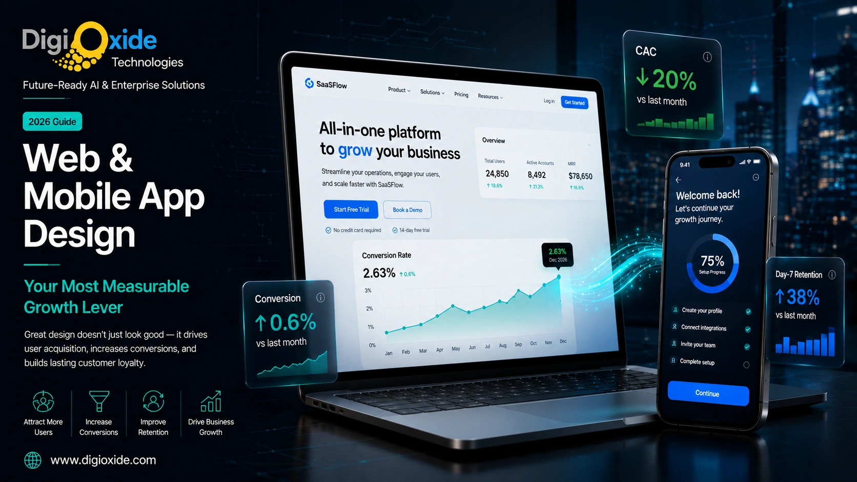
Roughly 97% of purchasing decisions are influenced by web design, and most users decide whether to keep or delete a newly installed app within the first three minutes. Design is not a brand expense; it is a measurable growth lever with calculable ROI that compounds across every paid and organic channel that feeds the product.
At Digioxide, we treat design as engineering. Every web and mobile app design engagement starts with the funnel, the metrics, and the user research, not with mood boards. Our design team has shipped products where measurable lifts in conversion and retention paid back the entire design investment within a single quarter, and that is the bar we hold every engagement to.
Why Design Is a Growth Lever, Not a Brand Expense
User acquisition is rarely lost on the ad. It is lost in the first eight seconds after the click. Users land on a page or open an app, scan, and decide whether the experience matches what they were promised. If it does, they convert. If it does not, they leave, and the marketing dollar that brought them is gone.
Three structural forces tie design directly to acquisition economics in 2026.
Paid traffic is expensive and getting more so
Google Ads, Meta, TikTok, and LinkedIn CPC and CPM are at or near all-time highs in most categories. Every percentage point of conversion lift cuts effective CAC by the same percentage. A redesign that takes landing conversion from 2.4% to 3.0% lowers paid CAC by 20% across every campaign feeding that page.
Attention is shorter than ever
First impressions form in 50 to 500 milliseconds and are driven by visual design before content. A user does not analyze your value proposition before judging; they look at the design and decide whether to keep reading.
Search engines and app stores reward quality
Google’s Core Web Vitals, Apple’s App Store, and Google Play all factor user experience signals into ranking algorithms. Better-designed products show up more often in discovery surfaces.
A serious investment in UI/UX design typically pays for itself within a single quarter on a mid-sized product. The math is uncomplicated: a small conversion lift, multiplied across every traffic source feeding the product, produces a return that dwarfs the design budget. This is the framing Digioxide brings to every design engagement.
How Web Design Drives User Acquisition
Web design that drives acquisition does five things well.
1. It Loads Fast
Page speed is the most under-invested acquisition lever. Google research has shown bounce probability rises sharply past 3 seconds: 32% more at 3 seconds, 90% more at 5 seconds.
The Core Web Vitals targets:
- LCP: under 2.5 seconds
- INP: under 200 milliseconds
- CLS: under 0.1
The work to get there includes:
- Optimized images (WebP or AVIF, properly sized, CDN-served)
- Critical CSS inlined, non-critical deferred
- JavaScript bundle splitting and lazy loading
- A real CDN (Cloudflare, Fastly, CloudFront)
- Server-side rendering or static site generation
- Eliminated render-blocking third-party scripts
- A real edge or origin server
Digioxide’s web design practice ships every site against Core Web Vitals targets as a non-negotiable. We audit performance on every project before launch and after launch, on real-user metrics, not just lab tests.
2. It Matches the Ad That Sent the User
Message-to-design match is the single largest controllable lever on paid landing performance. If the ad promised “10-minute onboarding for remote teams,” the landing page should say exactly that, in the same words, in the first viewport.
Practical rules:
- Match the ad’s primary phrase in the page’s H1
- Match the ad’s visual style and dominant color
- If the ad showed a feature, the page leads with that feature
- If the ad targeted a persona, the page speaks to that persona
This is why teams running paid acquisition at scale almost always have many landing pages, not one. Each campaign has its own variant tuned to its audience. Digioxide builds landing page systems for clients with multiple campaigns running concurrently, with shared components and per-campaign variants, so marketing can spin up new landing pages in hours instead of weeks.
3. It Has One Clear Next Action
The best landing pages have one primary call-to-action repeated 2 to 3 times down the page. Five competing CTAs feel democratic and convert nobody.
The discipline of one CTA forces clarity about the funnel. Email collection for nurture, demo booking for sales, free trial for PLG, direct purchase. Each is a different funnel. Secondary actions can exist but should not compete visually.
4. It Is Designed Mobile-First
In 2026, the majority of paid traffic in most categories arrives on a phone. A page designed on a 27-inch monitor and “made responsive” later will lose to a page designed on a 6.1-inch screen and scaled up.
Mobile-first forces good decisions:
- Hero copy short enough for 360px wide
- Primary CTA as a real, tappable button (minimum 44×44 points)
- Form fields stacked vertically, one input per row
- Readable without zooming
- Images sized for mobile, not desktop
5. It Builds Trust in the First Viewport
Trust signals in the hero do more for conversion than clever copy further down. The user is asking, in the first second, “is this a real business I can trust with my time or money?”
Specific trust signals that work:
- Visible logo and tagline
- Social proof: customer logos, ratings, real testimonials with names and photos
- Clear pricing or free-to-try signal
- Security/compliance badges where relevant (SOC 2, GDPR, ISO 27001, PCI DSS)
- Real address or about link
- Review counts, not just stars
Studies consistently show around 97% of purchasing decisions are influenced by web design. A small change like adding three real customer logos to the hero can lift conversion by 5% to 15% on a typical B2B page.
How Mobile App Design Drives User Acquisition
Mobile apps have a different funnel. The user reads an app store listing, installs, opens, and decides within 1 to 3 sessions whether to keep the app.
1. The App Store Listing Is the First Design Surface
Before the install, the user sees screenshots, an icon, a short description, a video, ratings, and reviews. Most app teams treat these as marketing assets to be produced after the app. They are design assets and drive 60% to 80% of install decisions.
Components that drive app store conversion:
- The icon. Must read at the small sizes the user actually sees (16×16, 60×60, 120×120). Most app icons are designed at hero size and never tested small.
- The first 2 screenshots. Most users swipe past more than two. The first two earn the install. Add captions explaining value, not just “Dashboard” or “Profile.”
- The video preview. 15 to 30 seconds showing the core flow. Apple and Google prioritize listings with video.
- The first sentence of the description. Carries more weight than the next 200 sentences combined.
- Ratings and reviews. Critical. Apps under 4.0 stars convert significantly worse than apps with 4.5+.
- Keywords (ASO). Title and subtitle keywords drive discovery.
A serious investment in app store listing design is one of the highest-ROI marketing activities a mobile product team can make, often delivering 30% to 80% install rate lift from the same impressions. Digioxide includes app store listing design as a standard deliverable on every mobile app project. We have seen install conversion double after a focused listing redesign on apps that previously had generic screenshots.
2. Onboarding Earns the Second Session
Most installed apps are never opened a second time. Industry data shows 25% to 40% of installs are opened only once.
Onboarding that earns the second session does three things well:
- Gets the user to a meaningful first action in under 60 seconds. The first message sent, the first ride matched, the first workout completed.
- Asks for permissions in context, not all at once. “Allow camera access to take this photo,” not bulk permission requests on launch.
- Shows progress, not setup screens. Get the user using the app while gathering information through natural use.
Our mobile app design practice treats onboarding as the most important feature of the app, because it is the gate to every other feature.
3. The First Screen Is the Product, Not a Menu
On the second open, the first screen should be the product, not a menu of options. A blank state is a failed first impression.
Examples done well: Spotify opens to recent listening. TikTok opens to the For You feed. Notion opens to the last edited workspace. Uber opens to a map. None of them opens to “set up your account.”
4. Touch Targets, Thumb Reach, Gesture Logic
- Minimum touch target: 44×44 points iOS, 48×48 dp Android
- Primary actions in the lower third, where the thumb lands
- Standard gestures work the way the OS expects
- Edge gestures avoid conflict with OS swipe zones
5. It Respects the Platform
Native iOS and Android conventions exist because users have already learned them. Violations create small but real friction tax on every interaction.
Cross-platform tools (React Native, Flutter) can deliver platform-appropriate experiences, but only if the design team is disciplined. “Identical UI on both platforms” is usually a mistake. Digioxide ships cross-platform apps frequently, and our design discipline is to deliver iOS and Android versions that feel native on each platform while sharing the underlying codebase.
6. Personalization, Performance, Polish
Personalization. Tailoring increases engagement substantially.
Performance. Cold start under 2 seconds. Screen transitions under 200ms. Gestures responsive within 100ms.
Polish. Micro-animations on state changes. Haptic feedback. Loading skeletons. Pleasant empty states. Thoughtful error messages. These compound into the difference between an app that feels professional and one that feels like a prototype.
Web Design vs Mobile App Design: How They Differ
| Factor | Web Design | Mobile App Design |
|---|---|---|
| Primary input | Mouse + keyboard, touch on tablets | Touch + gesture, voice growing |
| Screen sizes | Wide range, responsive | Tighter range, native-first |
| Distribution | Open web, link-shareable | App stores, install-gated |
| Discovery | SEO, ads, direct, social | App store search, ads, social |
| Update cycle | Continuous deploy | Versioned, store review |
| Offline support | Mostly online; PWAs partial | Often partly offline |
| Sessions | Short, goal-driven | Many sessions, habit-driven |
| Notifications | Limited (browser push, email) | Native push, deep-linked |
| Authentication | Email, password, SSO | Biometric, passkey, SSO, social |
| Performance budget | Bandwidth + render | CPU + memory + battery + storage |
The implication: web design wins or loses on the first session; app design wins or loses on the first three sessions plus the app store listing.
A strong design system bridges them, with shared tokens (colors, type, spacing, motion) and platform-respecting components. This is the deliverable Digioxide produces on most multi-platform engagements: one design system, three implementations (web, iOS, Android).
The Metrics That Tell You Design Is Working
Track these. If a redesign cannot show measurable lifts in at least three within 90 days, it was a refresh, not a redesign.
Acquisition: landing page conversion rate, app store install rate, CAC by channel, time to first meaningful action.
Engagement: engagement time per session, screens per session, funnel completion, form abandonment, rage clicks, dead clicks, crash rate.
Retention: day-1, day-7, day-30 retention, cohort curves, churn.
Performance: Core Web Vitals on real users, mobile cold start, time-to-interactive, error rates.
Quality: NPS, CES, app store rating trend, support tickets per active user, accessibility scores.
Digioxide instruments every project with the analytics required to measure these. We use PostHog, Amplitude, Mixpanel, GA4, Microsoft Clarity, or FullStory depending on client preference, and we make sure the instrumentation lives through to launch and beyond. A redesign without instrumentation is a redesign with no way to know if it worked.
Design Mistakes That Quietly Burn Acquisition Budget
- Hero copy describing the product, not the user’s problem. “AI-native workflow platform” sells nothing. “Stop sending 50 status emails a week” sells a demo.
- Forms asking for more than they need. Each extra field reduces completion.
- Hidden pricing. Forcing demo bookings to learn price reduces top-of-funnel conversion sharply.
- Cookie banners and modals on first load. Stacked modals are a measurable bounce driver.
- Carousels above the fold. Most users only see the first slide.
- Inaccessible contrast and tiny tap targets. Bad accessibility hurts every user, especially on bad conditions.
- Slow image-heavy pages. Blow Core Web Vitals and SEO ranking.
- Inconsistent design system. Drives hesitation, which is conversion loss.
- Mobile experiences feeling like crammed desktop.
- Chat widgets covering the CTA on mobile.
- Vague CTAs. “Submit” or “Click here” instead of “Start my free trial.”
- Ignored microcopy. Validation messages, errors, empty states, loading states all matter.
These are the patterns Digioxide’s design audits surface most often when clients come to us with a stalled conversion rate. None of them are dramatic. All of them are fixable.
Accessibility Is an Acquisition Lever, Not a Compliance Tax
Accessibility (WCAG 2.2 AA as the working baseline) is often filed under compliance. It is actually a growth lever.
- Larger addressable audience. Roughly 1 in 6 people globally lives with a disability.
- Better SEO. Accessibility wins are SEO wins.
- Better performance on bad conditions. Bright outdoor screens, slow connections, older devices.
- Regulatory protection. ADA, European Accessibility Act, India’s RPwD Act.
- Better quality overall. Teams that take accessibility seriously have better products.
Digioxide builds accessibility into every project as a default. Our designers and engineers are trained on WCAG 2.2 AA, our review process includes axe DevTools and Lighthouse audits, and we test with screen readers on real devices. Accessibility remediation on a launched product is 3 to 5 times more expensive than building it correctly from the start.
How to Run a Design Project That Actually Moves Acquisition
1. Start with the Funnel, Not the Homepage
Map every step from ad impression to activation. The two biggest drop-offs are where design effort goes first.
2. Set Numeric Targets Up Front
“Lift landing conversion from 2.4% to 3.5% in 90 days.” Subjective targets (“modernize the brand”) cannot fail and cannot succeed.
3. Ship a Design System Before Pages
A small, opinionated design system makes every later page faster and more consistent.
Starting design system:
- Design tokens (color, type, spacing, radius, shadow, motion)
- Core components
- Page templates
- Patterns (forms, empty states, loading, errors)
- Voice and tone
- Accessibility standards
4. Test on Real Users, Real Devices, Real Networks
Throttle to 4G or slower. Test on 4-year-old Android. Have a small device lab.
5. A/B Test the Highest-Leverage Screens
Hero, pricing, signup, onboarding step 1, paywall. Run for a full business cycle. Wait for 95% confidence.
6. Instrument Before Launch
Funnel events, scroll depth, rage clicks, dead clicks, form abandonment by field. Without instrumentation, you cannot tell what helped.
7. Iterate
The first version is rarely the final version. Plan for a 30-day stabilize sprint post-launch.
When to Invest in a Design Partner
A specialist design partner is worth it when:
- A product has product-market fit but conversion is stuck
- A founding team has built on engineering taste alone
- A redesign is needed without freezing feature work
- A new platform is being added
- An internal team has the talent but not the bandwidth
- A high-stakes deliverable is needed
The right partner brings a system, a process, a track record of moving the numbers, and senior judgment. Signals of a good partner:
- They ask about business model and funnel before visual style
- They ask to see your analytics
- They explain trade-offs, not just preferences
- They show before-and-after metrics from past work
- They build design systems, not one-off mockups
- They work in your codebase or know how to hand off to engineers properly
Digioxide brings each of these to every design engagement. Our UI/UX design practice covers research, design systems, web design, mobile app design, and the implementation work to ship the design in production. We run engagements as fixed-scope projects, dedicated team retainers, or design sprints depending on what the client needs.
Case Patterns: What Strong Design Looks Like
Spotify (mobile) combines intuitive navigation with personalized recommendations. Discover Weekly and Daily Mix make exploration easy. Lesson: personalization plus usability creates engagement.
Duolingo (mobile) gamifies learning with streaks, badges, leagues, and progress tracking. Lesson: gamification keeps users engaged when the underlying activity is effortful.
Airbnb (web and mobile) has clean design, powerful filters, high-quality visuals, verified reviews. Lesson: simplicity and trust-building win even for high-consideration purchases.
TikTok (mobile) delivers personalized content via algorithm with intuitive swipe gestures and minimal onboarding. Lesson: simplicity plus personalization drives engagement.
Uber (mobile) focuses on simplicity from booking to tracking. Transparent pricing, minimal input fields. Lesson: speed and clarity in key actions drive convenience.
Nike’s checkout (web) uses minimal design and copy, no forced registration, green checkmarks for feedback, auto-filled addresses. Lesson: minimal responsive autofilled forms are the conversion pattern for ecommerce checkout.
These are not random products. They are products designed with the discipline of treating design as a measurable acquisition lever. That discipline is what Digioxide brings to every client engagement.
The Psychology of Mobile App Design
Mobile app design is not just aesthetics. It is psychology.
Principles that show up often:
- Social proof. Reviews, ratings, “X friends use this app.”
- Scarcity. “Only 2 left,” countdown timers. Use carefully; aggressive scarcity erodes trust.
- Rewards and feedback. Badges, points, leaderboards, progress bars.
- Loss aversion. “Don’t lose your progress” is more motivating than “save your progress.”
- Default bias. Pre-selected options get chosen by most users. Design defaults ethically.
- Familiarity. Consistent design creates comfort.
These can be used to help users or to manipulate them. Ethical design aligns user goals with product goals. Manipulative “dark patterns” win short-term metrics and lose long-term trust. Digioxide will not ship dark patterns for clients; we have turned down work where the client insisted on them.
Frequently Asked Questions
How does web design affect user acquisition?
Web design controls conversion rate, page speed, and the first impression. A faster, clearer, mobile-first page converts a higher share of the same traffic, lowering CAC across every channel. Around 97% of purchasing decisions are influenced by web design, and first impressions form in milliseconds.
Why is mobile app design important for user acquisition?
Mobile app design decides whether installers become users. The app store listing drives install conversion. Onboarding and the first session drive retention, which app stores use as ranking signals. Better design lifts install conversion, retention, and rating, lowering effective cost per install.
What is the difference between web design and mobile app design?
Web design optimizes for many screens, mouse/touch input, short goal-driven sessions, SEO/ad discovery. Mobile app design optimizes for smaller screens, touch/gesture, repeat habitual sessions, app store discovery. Both share principles; the platforms have different conventions.
What is UI/UX design?
UI covers the visual surface. UX covers the entire journey: research, IA, flows, interaction patterns, testing. UI is a subset of UX. Most modern teams call the combined discipline “product design.”
How much does professional web and mobile app design cost?
Web design: USD 8,000 for a focused landing system to USD 80,000+ for a full marketing site and design system. Mobile app design: USD 15,000 for a small app to USD 150,000+ for a complex multi-platform product with research. Ongoing design retainers: USD 5,000 to USD 30,000/month. Digioxide scopes precisely after a discovery conversation; we do not give a price without understanding the project.
How do you measure design ROI?
Against acquisition and retention metrics: landing conversion, install conversion, day-7 retention, funnel drop-off, support volume, NPS, Core Web Vitals. A design lift from 2% to 3% on 100k monthly visitors generates 1,000 extra conversions monthly. Multiply by conversion value for the dollar return.
Should I design for web or mobile first?
Mobile-first in almost every case. The majority of traffic arrives on phones, and mobile-constrained designs scale up more reliably than the reverse. The exception is B2B SaaS used mostly inside an office.
What is Core Web Vitals and why does it matter?
Core Web Vitals (LCP, INP, CLS) measure real-user experience and are a Google ranking signal. Sites meeting the targets convert more, rank higher, and feel better to use.
What is the difference between UI and UX design?
UI is how the product looks (colors, typography, layout, components). UX is how the product works (research, flows, patterns, testing). Most modern teams blur the boundary.
How important is accessibility for user acquisition?
Very. Expands audience by roughly 15%, improves SEO, helps on bad conditions, reduces legal risk. Digioxide builds accessibility into every project as a default.
How do you avoid generic AI-style web design?
Real research, real differentiation, real craft. Generic comes from copying trends without thinking about fit. The fix is process: brand discovery, content strategy, custom photography or illustration, a design system that codifies choices.
How long does a full redesign take?
Marketing site with small design system: 8 to 14 weeks. Full SaaS app redesign with system and testing: 16 to 28 weeks. Mobile app redesign across iOS and Android with research: 16 to 24 weeks.
How do I start a design engagement with Digioxide?
The starting point is a 45-minute discovery call where we look at your current site or app, your analytics, and your funnel, and identify the two or three highest-leverage design improvements. From there we typically scope a fixed-fee design sprint or a longer engagement depending on the scale. The discovery output is yours regardless of whether you proceed with us. Get in touch through our contact page to schedule.